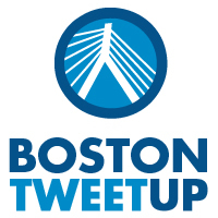
Hello all! We have gone through all the logos submitted to the Redesign Contest and here are the top three concepts we’ve selected. Which one do you like?
Vote and help us decide! We’ll announce the winner next Monday.
We really appreciate everyone’s hard work and concepts and are really excited to unveil the top 3 logo design concepts.
Which concept best represent BostonTweetUp?
And the @BostonTweetUp Logo Winner is …
View Comments (1)
I know i'm late, but here is my 2 cents. I think logo 1 best captures the tweet up feel. It feels more techy (in a good way). The font, the colors capture it for me. That would be my pick.
Logo #2 would come in second. It is the cleanest and most professional looking logo. If Boston Tweet up is looking to be seen as super professional, then this is the way to go. The logo can easily transfer to a t-shirt (I actually can envision it on a white t-shirt that has the collar and edge of the sleeves in navy blue), stickers, etc. hmmm, it would be interesting to see if you could sneak a bird in there some how.